Graphic Eye Store: Iain Laurie's Horror Mountain

Our debut publication! Buy it now at our store, or read about the method behind our madness here.

Review: Only Skin by Sean Ford

Family, loneliness, ghosts and murder in this impressive debut graphic novel.

Review: The Moon Moth by Jack Vance and Humayoun Ibrahim

A classic science-fiction tale gets a new, comics adaptation.

Feature: Taste-testing the Apocalypse, part 4

It's the end of the world as we know it, and I feel drunk.

Weekly Reviews: The Secret Service #2 and The Manhattan Projects #3

Reviews of the better offerings from the spinner racks.

20 May 2012

Editorial: Art vs Commerce (or, "Buy Our Comics!")

Today sees the one-year anniversary of the launch of Graphic Eye.  It's been a strange, interesting experiment; launching a new website in an already-crowded scene, wrangling writers and cartoonists, and trying to maintain some semblance of a regular schedule.  The site has had some ups and downs, its golden periods of quality articles and its half-hearted ones where life has got in the way, and some pieces have been posted that I wish had never been written.  Reflecting on our last year, though, my feelings are that the successes have outweighed the failures, and so, older and somewhat wiser, today begins the next phase of Graphic Eye.

Even though we use the Blogger platform, I've never referred to the site as a blog -- my definition has always been "an online comics magazine" where the driving principle was always thoughtful writing and interesting cartooning.  We avoid news, since other sites do that better than we ever could, and other fluff pieces, since the aim has never been to generate clicks or become fodder for casual browsing.  With this came the decision to avoid advertising on the site.  Early on, we used AdSense and Amazon Affiliate links, but not only did this cheapen the look of the site, but also ran contrary to our principle of valuing art over commerce.


However, today you may have noticed a new link on our navigation bar: Store.  Yes, as of today, we have become a small-press publisher and are looking for your money.  We felt this was a more honest way of supporting the site and our meagre operating costs, and also a better way to increase the exposure of our roster of cartoonists.  We will be appearing at some small-press comics fests in the near future, plying our wares, shaking hands and kissing babies.

Our debut publication is Iain Laurie's Horror Mountain -- a 22-page odyssey into the mind of our resident cartoonist.  We've been sending out advance copies, and it's already gained high praise from Nick Abadzis, Frank Quitely and Jeff Lemire -- we hope you'll enjoy it even half as much as they did.  In the following weeks, we'll be featuring some other works by Iain, including his multimedia meditation on boxing, Slugmix.

Later on in the year, we hope to release new works by Craig Collins and Ian Burns, and possibly some other surprises.  Of course, we'll still be keeping our (mostly) regular schedule of reviews, interviews, features and comics -- we'll just be a little more tangible.

I hope you'll stay with us and continue to support our endeavours, whatever form they may take.

Thank you for reading!
Gavin Lees

Review: The Moon Moth by Jack Vance and Humayoun Ibrahim


The Moon Moth – Jack Vance (w) Humayoun Ibrahim (a)
First Second, $17.99, ISBN: 978-1-59643-367-0

Jack Vance has always been the connoisseur’s sf writer.  Never attaining the widespread acclaim of the likes of Philip K. Dick or Arthur C. Clarke — possibly due to the absence of a middle initial — he nevertheless inspired a loyal cult following whose number includes Ursula K. Le Guin, George R. R. Martin and Michael Chabon.  Perhaps it is his devotion to sf that hid him from many literary readers, or his verbose, babel-tongued prose that kept the wolves of Hollywood from his door.  But greater acclaim may have cheapened his work and, as it stands, Vance is a shibboleth among the cognoscenti; a gateway to unexpected, unimagined worlds.

So, it is with great intrigue that First Second present an adaptation of one of Vance’s most acclaimed novellas, by debut artist Humayoun Ibrahim.  The Moon Moth is as much a mystery as it is an sf genre piece.  Edwer Thissell is sent to the planet Sirene as an ambassador, but finds it difficult to intregrate with the culture, where status is shown by the masks its inhabitants wear and proprietary is held in the highest regard.  Thissell soon finds himself searching for a murderer, a task made all the more difficult by the customary masks and the fact that no-one is necessarily who they appear to be.

 It’s an ambitious undertaking for any artist to adapt the work of a respected author, but this is especially so with Vance, as so much of his appeal lies not in his plots, but his beautifully florid prose. Irbrahim manages to capture some of this lyricism in his illustrations.  His style is clear, but embellished with rich details that give a storied aspect to each of the characters.  The intricacies of the textures and the expressiveness of his line matches the baroqueness of Vance’s writing.  For instance, Cornely Welibus wears a mask that Vance describes as consisting of “…a blue disk inlaid with cabochons of lapis lazuli, surrounded by an aureole of shimmering snakeskin,” which Ibrahim renders thus:


It’s to his advantage that this is one of Vance’s more dialogue-heavy pieces — and all the dialogue remains here intact — but when new concepts or neologisms are introduced, they’re rendered with flair and imagination.  One of the quirks of The Moon Moth is that the alien characters sing to one another, or play instruments, to communicate.  This is rendered in the adaptation through ornamented speech balloons and evocative uses of colour.

As a whole, the quirky, yet low key plot coupled with the vivid, stylish art makes The Moon Moth feel very much in the vein of the New Fantasy that has taken hold in comics recently — exemplified by works like Powr Mastrs, The Mourning Star, and Artichoke Tales.  Whether intentional or not, this manages to place Vance as the progenitor of the tradition and highlight just how powerfully resonant his work can be.

 -- Gavin Lees

Feature: Taste-testing the Apocalypse, part 4

Elysian Peste

To celebrate the impending apocalypse (or capitalise on popular misconceptions of ancient mathematics) Fantagraphics have made a strange alliance with fellow Seattleites, Elysian Brewery, to release a series of 12 speciality beers with label art by Charles Burns. The beers are being released at a rate of one per month, with this month's brew being “Peste” ("Plague" in what might be a subtle nod to Burns's Black Hole graphic novel) which is a chocolate ale made with no less than five different chilis.

While the prospect of such a spicy brew may not seem overly inviting, its aroma belies its hidden fire with aromatic sweetness.  The first impression is of a botanical soda (like Dandelion and Burdock) with slight undertones of chocolate.  While chocolate normally adds to the richness of a porter or a stout, in an ale like this it seems to smooth the bitterness.  It obviously reacts with the brew, as the head is tinted brown, and is a lighter, stiffer affair than most of Elysian's ale, and crackles as it dissipates.

Upon first taste, there is not much of the chilli present, and the first thing that hits is the chocolate flavours.  Coming across as a lighter version of a chocolate stout, it is more sweet than bitter.  Yet the consistency is smooth, and not as sickly thick as the taste might imply.  It's only after the second or third quaff that the chillies hit, and hit they do!  The five varieties used in "Peste" not only build the spiciness of the ale, but are combined to activate different parts of the palate.  The sharpness of the cayenne stings the front of the tongue, while the softer smokiness of the chipotle peppers settles further back in the mouth.  It's a little overpowering at first, but eventually settles and allows the chocolate and cinnamon to better express themselves.

The ale hiding behind all that sweetness and spiciness is a fairly pedestrian affair, which lets the speciality flavours gain more definition.  There's a middling hop strength, and a smooth, velvety aftertaste.

With all the chillies, this is fine as a novelty brew, but is too overpowering to be drunk casually, or fit well with any food accompaniments. Elysian could make a winner out of a plain chocolate and cinnamon ale, which would have a much better balance of sweet, bitter and spice.  The ambition in this brew is admirable, but sadly the execution is just too raw to mark it as any kind of success.


-- Gavin Lees

Review: Only Skin by Sean Ford


Only Skin – Sean Ford (w/a)
Secret Acres, $21.95, ISBN: 978-0983166207

Sean Ford is one of the increasing number of CCS graduates who are beginning to make their mark on the comics landscape.  Only Skin is his debut, long-form work, created over the course of five years.  Its lengthy gestation is appropriate, given the creeping, slow-burn of the narrative and its empty, lonely mood. Only Skin flows from the heart of the American Gothic tradition, and tears away layer after layer of pretense to expose the raw core of the country, with a sly, subtle dash of the supernatural.

The story concerns two young siblings, Cassie and Clay, who return home to take over their family gas station business after their father has gone missing (presumed dead).  The small town they come back to has changed, having had its air of civility shattered by a series of infidelities and a growing distrust in the local sheriff.  Things come to a head when more people begin to disappear and body parts are found around town.  The brother and sister become inextricably connected to all these events, and are haunted by what could be the ghost of their father, who guides them towards the uncomfortable truth that lies beneath the town’s naïve and quaint exterior.

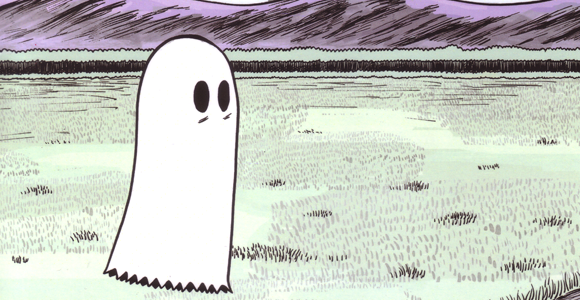
There are obvious embers of David Lynch’s Blue Velvet in Ford’s work — particularly in the discovery of severed body parts — but the overall feel of the work is much more literary than it is cinematic.  There are touches of Cormac McCarthy in the narrative, given the juvenile point-of-view that we see events from, and the jarring interjections of violence into the remote, isolated setting.  Having such a serious tenor set for the story, it makes the interjection of the ghost — drawn like it’s straight out of a child’s notebook, with a white ragged sheet and two gaping black eyes — all the more puzzling and intriguing.  From one perspective, we can see it as metaphorical, with the ghost really being a representation of the children’s past that they cannot escape, and their desperate wish to be reunited with their father.  The origin of their names is made clear from the Cassius Clay poster that hangs prominently in his bedroom, and drives home the fragmentation of the family unit: Cassie, Clay; all that’s missing is “us,” a sense of family unity that they can never reclaim.

From a different perspective, we could read the ghost as a diversion into magical realism, and a manifestation of the children’s repressed thoughts of their father’s death.  The dislocation we feel as a reader upon the ghost’s intrusion could be seen to be comparable to Cassie and Clay’s own feeling of disorientation and fear, having to survive in the world without the guidance and support of a family unit.  Ford’s artistic style really helps to sell this central enigma and make it believable part of the narrative fabric.  Using a clear line style for his characters, they tend toward the abstract and iconic, so the ghost’s simple rendering does not seem out-of-place, but wholly integrated.

While the characters may be simply rendered, there is a clear drive on Ford’s part to suture us into a very real and unique locale through his lush backgrounds.  With sweeping brushstrokes he carves out the expansive, mountainous landscape and seems to delight in full-page wordless spreads where the silence and desolate beauty of the town is practically palpable.

Indeed, if there’s one constant in the book, it’s that unsettling feeling of loneliness and separation that permeates every line and every word.  In Only Skin, Ford holds a mirror to our own anxieties and presents a world where the most terrifying thing is neither ghosts nor murderers, but our own insecurity.

-- Gavin Lees

Weekly Reviews: The Secret Service #2, Manhattan Projects #3


The Secret Service # 2 - Mark Millar (w) Dave Gibbons (a)
Marvel Icon, $2.99

The Secret Service # 2 is actually kind of fun. There isn’t any excuse to continue reading Mark Millar’s books but, for those of us who can’t help ourselves, this issue delivers. It isn’t original, not by a long shot, but the opening scene alone is well worth the price of admission. At least if you’re a fan of ridiculous over-the-top violence, which this column is a frequent proponent of.

The Secret Service is a pretty by-the-numbers spy story. A man with a License to Kill (yes, the character actually says he has one) introduces his nephew to Spy School while he runs off on another mission. More than likely in the next issue the nephew will have to save his uncle’s ass, as well as the world. Said ass-saving and world-saving will take place in the fourth issue.

Yes, it’s predictable, but other than a few pieces of dialogue this is a Millar book that isn’t embarrassing to read. The main reason for that is it doesn’t feel like a bloody film. It should, because it is, but Dave Gibbons’ art helps to suck the reader in, and makes this is a compelling read. Co-plotter Matthew Vaughn might have something to do with that as well.

Really, you could worse. People talk endlessly about Brian K. Vaughan’s Saga (out this week as well), but this is a much more enjoyable read. At least you know going in that it’s going to be predictable.

Yes, I’m recommending a Mark Millar book. Now will someone contact my LCS and tell them to stop me from buying Hit-Girl? For some reason I never can help myself.  This shit is worse than crack.


The Manhattan Projects # 3 - Jonathan Hickman (w) Nick Pitarra (a)
Image Comics, $3.50

If you’re a Warren Ellis fan, and you aren’t a Hickman fan as well, what have you been reading for the last couple years? With Ellis largely disappearing from comics, Hickman is his spiritual heir, even if he usually lacks the same sardonic humor.

With all the superhero bullshit and re-launch shenanigans it’s easy to forget about the independent writers. Of course, yesterday’s independent writers are now helping lay the foundation of the mainstream universes, but none of them have yet to return to their roots with as big a splash (creatively speaking) as Jonathan Hickman has.

The Manhattan Projects, one of Hickman’s two current ongoing creator-owned projects, finally gets great with this issue.  The pieces start to fall into place, and we almost get a glimpse of what the book is about, outside of its real-life science and history gone alternate-universe-mad.

Really, just as with Hickman’s other Image book, Secret, it’s hard to say too much about this book without spoiling the shock and surprise. Sometimes it’s fun to be left in the dark.

Nick Pitarra’s art is slightly off-kilter, and a little strange. He exaggerates facial proportions slightly, but not enough to bring his figures into the realm of caricature and jar with the serious tone of Hickman's writing. It’s also nice that the cast of the book is finally revealed.

The Manhattan Projects has felt like a series of (mostly) done-in-ones, and that was the only flaw in the first two issues. They didn’t feel cohesive. Here we finally get a glimpse of the bigger picture.

As with pretty much everything Hickman writes (even his Fantastic Four is a fantastic mindfuck) this is highly recommended. There are a lot of great writers bubbling just under the surface of mainstream comics, but none of them are writing books this good. Hickman may be hitting his peak, but this isn’t a bad thing. The next few years are going to be a lot of fun.

-- Jeffrey Whitelaw

Twitter Delicious Facebook Digg Stumbleupon Favorites More