English
designer and illustrator, Josceline Fenton is a relative newcomer to the comics
world, but has gathered a dedicated following with her webcomic, Hemlock. Like the Brothers Grimm
filtered through shoujo manga, it’s a
charming and increasingly dark fantasy tale.
As she had recently wrapped-up the third chapter and announced some fairly
high-profile anthology appearances, I decided to speak to Josceline over email
to find out more about her life and work.
Let’s start by talking
about your comic, Hemlock, which is probably how most
people know you. For those who may not be familiar with it, can you tell
us a little bit about the premise?
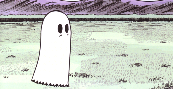
Hemlock
is a fairy tale set in the forests of 19th century Scandinavia, following the
story of a witch who accidentally married a monster 800 years ago. It’s
difficult to summarize it beyond that, the premise is revealed slowly over the
first two issues, so I don’t like to spoil it too much!
It seems like the story could really
take place anywhere, so why did you choose to set it in Scandinavia?

I’m
half-Swedish, so Scandinavia had a big influence on me when I was growing up.
When I was small, my grandpa would make up stories about trolls and all sorts
living in the forest. Even now when I go to visit my family there, I like to
take the time to go and wander around the edges of the forest, it still has
that sense of magic to it. I want to try and express that feeling in Hemlock.
Also, I’m interested in folk costume and languages, and the way they influence
each other on a shared land mass, which is probably why there are Russian fairy
tales showing up in Hemlock. All of the characters are either from some part of
Scandinavia or Russia. I’ve assigned a nationality to each of them, for example,
Ulla is Norwegian, Tristan is Swedish, Lumi is Finnish and the Baba Yaga
brothers were born in various parts of Russia.
Did you do a lot of
research into the folktales of these various countries? It seems like the
oral tradition, that your grandfather passed down to you, is often very
different from the documented stories.
I
wouldn’t say I did “a lot” of research, though I did more research into Baba
Yaga stories than I did into Swedish folktales. The stories my grandpa told me
were made up on the spot, and the rest of what I know is just general cultural
knowledge I’ve picked up. So I guess that makes them more individual, as
opposed to the written stories. I’m sure I misremember things.
The
story begins with an epigram from T.S. Eliot’s “The Wasteland” — did you draw
inspiration from his work, or any other literary influences?
Actually,
I’m not a very literary person! “The Wasteland” is one of my favourite poems,
but I’ve always said that if I had to study it in detail, I would probably
start to hate it. That’s a terrible attitude, but I like the mystery of it I guess.
The reason I included it at the beginning is twofold; the “other places” where
half of the story takes place is a wasteland that doesn’t fully exist yet. You
can get there by various means, but one of them is by falling through your
evening shadow. The other reason I included it is that, as far as I remember,
the poem has a sort of dread about the dawn of the modern age after the World
Wars, which is a background element of the story in the Witches’ court. We’ll
find out more about that later though. I suppose the main literary influences
on Hemlock would be fairy and folk tales – there’s a bit of Beauty and the
Beast in there as well as the Baba Yaga legends.

The tale of Baba Yaga
that’s in the second chapter isn’t the commonly-known image of the witch in the
chicken-leg house. Is that story of your own invention?
In
the original tale of “Vasilissa the Beautiful”, Baba Yaga has three riders that
she commands. They’re only briefly mentioned, but I wondered how she would be
able to command Night, Dawn and Day, so I took that and turned them into her
three sons instead. She’ll still have her chicken-leg house though! I also kept
her as a very old witch. The first drawing of her is as a young woman, but by
the end of the tale she’s wrinkled and cranky like we know her.
The Baba Yaga is one of
my favourite folktales, just because she's so surreal -- the house on chicken
legs, flying in a mortar and pestle — and you have your own witch, Lumi,
who lives in a giant snail's shell. Is that sense of the absurd important
to folktales, do you think?
I
think so. When you think about it, even witches flying on broomsticks is a
pretty strange thing.
Where did you get the
idea for Richmond, the snail house? Is that something from Scandinavian
folklore?
The
idea for Hemlock started with a
four-page short story I did called “Starvation Soup” in which a tramp proposed
to Lumi and offered a snail as a ring and its shell as a house. Richmond was a
leftover from that idea. He’s also inspired by the work of one of my favourite
artists, Furukawa Tomo.
One of the things that I particularly
like about Richmond is that he has his own language. How far have you
delved into creating the snail-speak?
Not
very far, actually, it’s mostly nonsense except for a few characters like the
“frogsbody” symbol. The “hello” symbol is meant to look like a hamsa amulet.
The snail-speak is vaguely inspired by Tibetan and Sanskrit writing. Someone
asked me what it would sound like spoken, I told them that Richmond’s speech
sounds like soup bubbling.
How much of the story do you have
plotted-out? Do you find yourself improvising a lot?
Well,
I know how the story ends, and I know what has to happen in each issue to get
there. I tend to write snippets of dialogue and then rearrange them into the
right order. It’s a balance between planning it well and giving myself room to
improvise, because if I didn’t have that room, I would get bored of doing it
very quickly. I rarely write a full script with descriptions of the scene or
how many panels I want per page, that’s where I do a lot of my improvisation.
Sometimes I add things in when I realize that it works better for the overall
story than what I’d originally planned – the twist at the end of chapter 3 is
one of those things. I’d had chapter 3 written for a long time without the last
two pages.
How long do you see Hemlock continuing?
The
story lasts six issues or chapters, so, however long it takes me to finish
them. I’ve considered doing a spin-off, but I’m still working over that idea in
my head. I may also do a few short stories with it afterwards.
Your
art has progressively become more confident as Hemlock
develops. How much of a learning experience has making the comic been?
A
huge one! I hate looking back at chapter one now, the art looks terrible to me!
But I know that even if I redid all the art, by the time I finished, I’d have
improved again, and it would be a constant cycle of redoing it. I have to just
keep going forward! I was very nervous when I started about putting my work
online, because I didn’t deal with criticism well, I let it get me down too
much. I think I’ve learned to deal with it a bit better through doing Hemlock.
The feedback you've been
receiving has been very positive, though, and you've built up a bit of a
fanbase. Has that helped you keep momentum with the project?
Absolutely.
Part of why I put it online in the first place was to feel like I had an
audience to tell it to, and I’m so happy that they’re very receptive and
encouraging. I feel like I have a duty to update now! Which is good, it keeps
me going with it – otherwise all I’d be doing is my university work.
You said earlier that
you're interested in folk fashions and certainly the costumes in Hemlock are an important ingredient. Are
you aiming for a particular time-period with the look of the characters?
It
changes for each character. For example, Ulla is a very fashionable witch, so I
try and keep her in period with clothes from around the 1850s and 60s. Lumi is
more interested in comfort and practicality, so her clothes are inspired by
folk costumes and the kind of “aesthetic” dress of Pre-Raphaelite women and the
paintings of Carl Larsson’s wife and daughters. The three princes take their
costume cues from European and Russian royalty, though the period is fairly
loose.
How much research do you
do to get the right looks for the characters?
I
collect art and photo books, I have quite a few on historical costume. So
whenever there’s going to be a costume change, I pick a bunch of them off my shelves
and I sit and look through them until I find a combination of things I like and
are appropriate for the character. Sometimes it will just be the silhouette,
other times it will be a slightly altered version of a real garment. Their
hairstyles are a different story though! Those have no basis in reality.
Browsing through your DeviantArt page,
it's clear that your early drawings were heavily inspired by manga. Now,
though, that influence is less prominent — what other art styles have you been
inspired by?
I’m
glad you say so! I’ve been trying to shake the manga influence for years but
it’s so ingrained in my storytelling style. I was inspired for a while by
artists like Junko Mizuno, FSc, and a lot of others, but these days my
influences are mainly from a mix of animation and illustrators from the
beginning of the 20th century like Aubrey Beardsley, John Bauer, Harry Clarke
and Kay Nielsen.
I love those
illustrators, not just for the quality of their line, but because they can be
so evocative with a single image. Would you say that your own stories are
propelled more by images than words?
It’s
hard to say. I try to avoid more words than are necessary, I don’t like to use
thought bubbles or narration boxes, but dialogue is definitely a big part of my
stories. I guess they’re equally important to me. I’ve been toying with the
idea of doing a wordless comic made up of single images as part of my degree
work though.
You
mentioned that you’re still at university just now. What are you
studying?
BA
(Hons) Graphic and Media Design. I specialize in design for print, I’ve just
started my final year. I don’t regret choosing this course, I’ve learnt a lot
of useful things, but it has also taught me that I’m not a pure graphic
designer. I’m somewhere between an illustrator and a designer.
That’s
probably a very apt description of what a cartoonist is! Are comics where you
see your focus remaining in the future?
I’ll
always do comics in my spare time, but I’m not sure I would focus on them as a
career. I’d like to go into print and publishing. Maybe I’ll combine my love of
comics and book making by publishing other people’s comics!
Given an unlimited
budget, then, who are the cartoonists that you'd publish?
Oh
gosh, there are so many cartoonists out there! Actually, with that unlimited
budget, I’d concentrate on making the books the best they could be, with all
the finishes and quality paper they deserve. So whoever I’d publish, I’d make
sure their books were things to treasure.
I
think that's becoming a more and more important aspect of publishing these
days, but you weaseled out of the question! To put it another way, then,
who are some current cartoonists that you think deserve more attention?
Damn,
you got me! Okay. Mickey Quinn and Nicole Mannino do lovely work. Madeline
Rupert’s webcomic Sakana is one of my
favourites as well, she’s so good with black and white. J.N. Wiedle is also
fantastic, he’s behind the adorable webcomic Helvetica. Over here in the UK, Nicola Stuart (Nikki Stu) and Sarah
Burgess both have wonderful styles, they’re so unique. I hate questions like
this because I’m sure I’m missing out tons of people…
 Even though Hemlock appears online, you seem quite dedicated to
regularly putting out printed chapters. Do you think there'll always be a
market for print books?
Even though Hemlock appears online, you seem quite dedicated to
regularly putting out printed chapters. Do you think there'll always be a
market for print books?
I
like to think so. I’m not much of a fan of e-books and PDFs, and I try to buy
printed copies of webcomics I like. My parents have a massive collection of
books, so I grew up looking at walls that were covered head to toe in
bookshelves. You can’t replace the feeling of a book in your hand or the smell
and texture of the paper. However, I also think that print on demand has more
of a future in it than mass-produced books. It’s more expensive at the moment,
but it makes more sense to me than printing books people may or may not
buy.
I know you publish your
work through Lulu. Have you found that to be quite successful? I
ask because I know quite a few UK cartoonists abandoned them when their prices
went up and it was no longer economical to use them.
Yes
and no. Their prices go up and down, they’re not too bad at the moment. I like
the convenience of using Lulu since I don’t have to deal with posting and
packing books, and I’ve always liked the binding and the interior print
quality, but I wish there were more options for the covers. I wouldn’t
recommend them for colour work either.
You're involved in the
Nelson book by Blank Slate, which I've heard quite a lot about — 50
artists working on a single story, edited by Woodrow Phoenix. How did you
become involved with the project?
Someone dropped out at the last
minute, so Woodrow asked me to take their place. I was really happy, but, it
was two weeks before I had to go to China with my university! So really, I only
had a week to see what everybody else had done, sort out the script with
Woodrow, pencil, ink and colour it. It was pretty stressful, but I couldn’t let
an opportunity like that pass me by. I wish I’d had more time to do it in
though.
Was it intimidating sharing a space with
the likes of Roger Langridge, Carol Swain and Rian Hughes?
Definitely! I feel like I have a
lot to learn compared to them.
I
know you've contributed to other anthologies, like Paper Science. Do you find that this allows you to experiment more with your
comics?
That depends on the anthology.
Some of them I find stricter because of having an editor to work with, others
let you do whatever you like. The ones with editors always want me to put in
more panels! It’s odd for me, my storytelling style is quite minimal in terms
of panel counts. Sometimes it works with more, sometimes it doesn’t.
Are
there any of those contributions that you're particularly proud of?
The
Paper Science strip! It’s hard to
tell how colours will look when printed on newsprint, but I thought they turned
out really well. That’s probably the largest page I’ve done too, my work is
usually much smaller. It’s also an example of “more panels!!!” that worked out
for the best.
I
know that you’re a regular at the London MCM Expo. Have you found the
British small-press scene to be quite supportive?
Oh,
definitely. There are so many lovely people, I’ve met some of my best friends
through the small press scene. I’m a shy person and I’m not good at talking to
people, but they’ve always been welcoming and patient. I’ve been drawing comics
since I was 10, but it was seeing the small-press scene in London when I was 18
that got me into self-publishing, I wanted to join in!
Do you ever feel like small-press communities become
a bit of an echo-chamber (or, to be crass, a circlejerk) and, while being
encouraging, you're not really getting the criticism you need to develop your
art further?
Yes, but the same
can be said of graphic design communities, mainstream comics, indie comics, any
art in general. I don’t notice it too much though because I have a hard time
taking praise as well! I’m too busy looking at the flaws in my work — art
school and Hemlock have turned me
into a massive perfectionist. I’m never happy with my drawings for long, but I
suppose that’s useful in that it helps me to keep trying to improve.
Do you ever have the
temptation to go back and redraw pages before you publish them in print?
All
the time, but I try not to change them after they’ve been put up online. Before
that I do sometimes redo pages. It mostly happens when the entire layout looks
wrong to me. If there are panels I liked on the scrapped page then I’ll cut
those out and paste them onto a new one. That happened on the last page I did,
actually! And it was only the second page of the chapter, dear oh dear.
From some of the information you’ve posted, I
see your art is a hybrid of traditional and digital techniques. Would you ever consider going fully digital?
It depends on the project I think, sometimes digital is more
appropriate. I’m a bit out of practice with digital art at the moment though,
because I’ve spent so long doing Hemlock traditionally.
Obviously you’re going to be focusing on your
studies but, aside from continuing Hemlock, is there anything you’re aiming to achieve
with your art in the near future?
Hemlock and university eat up all my time, so, I’m really
just aiming to get through them first before I even think of anything else! I’d
like to keep improving my art as I go along. After I finish my degree I want to
try and do a few conventions in the US and Canada, but that depends on how much
I can get saved up.